Blue is mostly a man-made colour so it’s fitting for industrial use. It’s not a colour easily found in nature. It’s a colour that was made in a lab with chemists. The closest colours found in nature that represent the colour blue are indigo, cobalt blue and lapis lazuli (ultramarine.) International Klein blue and Phyllo Blue are artificially made pigments that changed popular cultures perception of the colour blue. And the three most commonly used blues in industrial work are Indigo, Prussian blue and Reflex blue. (This is not including process blue in production.)
Why is blue so important
Blue is an industrial colour that most designers and printers use still because of a few reasons. Most people like the colour blue. It’s a calm colour that is not as harsh on the eyes like red or black or low visibility problems like yellow. We have always seen dark blue has a writing colour. And people have a connection with the colour from its rarity, oceanic/sky appearance and cool radiates.
This post will be broken down into three different posts:
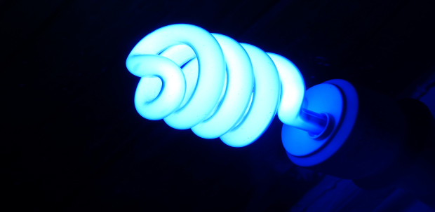
In the meantime, here are some images using these colours.
Share this: