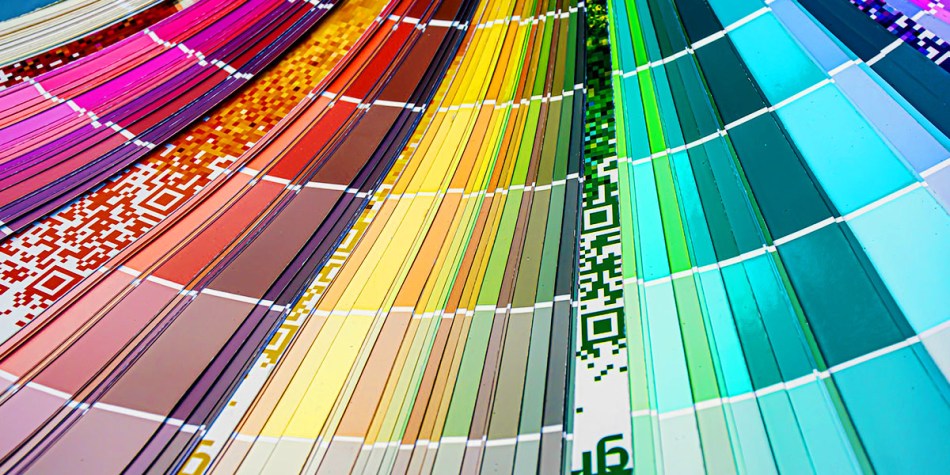
Designers, production artists and other creative field types would use a printed colour match swatch book to make sure the design is using the correct colours and will have coordinating colours with different print mediums. This is especially important for designers designing on a computer screen which is RGB and sending it to print without worrying if the colours are going to be skewed. It’s good to have a colour-matching system you are comfortable using that is not only used with your printer, too.
Pantone Matching System
Often abbreviated to PMS, Pantone is a widely used and known colour match system that caters to various print mediums, for example, textiles, apparel, beauty, interiors, architectural and industrial design to name a few. They are both available digitally and in print. There is also an educational school called the Pantone Colour Institute where colour theory, history, trends and case studies are examined.
There are colour books available online and in print, conversion colour systems, devices, swatches on fabrics and a variety of tools for colour matching and colour management.
Company site: Pantone.com
Munsell colour system
The Munsell Colour System is a colour system that uses hue, chroma and value within a 3D model. This was created by Professor Albert H. Munsell who wanted a “rational way to describe colour” that wasn’t misleading or sound stupid. A Color Nation in 1905 was the first book with the method he developed.
There are 3D models and colour books available for design programs but the system is used for other industries like forensic pathology for hair and skin colour, breweries to match batches, agriculture soil, and dentistry. There are colour books, colour swatches, colour vision tests and educational sets if you want to learn more.
Company site: Munsell.com
CIELAB colour space
This system is from the International Commission on Illumination which measures colour with a LAB since 1976. The L* stands for lightness, the a* is red/green values and b* is the yellow/blue values of the colour.
The Hunter Lab uses stars in the LAB to read L*a*b system [L-star, a-star, b-star]. It uses the tri-stimulus model with the centre plane being grey or neutral. It’s on a 3D chart that uses longitude, latitude and altitude to locate and communicate colour values. It wasn’t accepted as an international model.
There’s no standard book of CIELAB but there are many colour books available with coordinates in bookstores. But this system is used in colour calibration devices like spectrophotometers.
More information: Xrite.com & hunterlab.com
Ostwald colour system
This system was used in the Bauhaus design studio and Winsor & Newton paints supply company. The method of the colour model is a spinoff of the Munsell “colour atlas” by Latvian-German chemist Fredrich Wilhelm Ostwald. He first developed his colour theory and classification system then published his findings in Die Farbenfibel (The Colour Primer.) The chart was arranged to have four hues (yellow, red, blue and sea green) in a finite collection spaced evenly 24 colours apart. The chart eliminated some intermediate colours if they didn’t work out within the colour space.
There were several books published between 1942 to 1972. The editions are called The Colour Harmony Manuals with the last book having 949 colours mentioned. The books are now out of print.
NCS colour
NCS stands for Natural Colour System. The system is based on the colour opponency hypothesis of colour vision of white, black, red, blue, yellow and green. It’s measured in blackness, whiteness, chromatics and hue of the six colours in the chart. The hue-based colour are on the outside of the chart and shifts to more saturated colours to the centre. The lighter tints go towards the top and the darker shades towards the bottom. It also measures how saturated or light a colour is.
There are colour books, apps, colour pins and paint chips that use NCS colours.
Company site: NCScolour.com
RAL Colour chart
RAL colour management system is from a German that began in 1925 in trade, design, architecture and industries. RAL stands for Reichsausschuss für lieferbedingungen. The RAL Design category was introduced in 1993. It’s a system based on CIELAB colour space, specifically the cylindrical CIEHLC. Then in 1995, RAL Digital focused on virtual colours as seen on their floppy discs and VHS tapes. They are approachable with a high standard always coming up with new products for various industries.
They sell colour books, swatches, trend boxes, colour atlas books and chips.
Company site: www.ral-farben.de/en/
DIC digital colour guide
This company sells various industry-standard products for many industries even colour management systems for product manufacturing. The company started as The Dragon Mark in 1908 in Japan until it changed its name to Dainippon Ink and Chemicals in 1964. The colour swatches are available in Illustrator already.
There are free software applications available on Google Play and the App Store.
Company site: www.dic-global.com
TOYO Color Finder
This colour swatch catalogue is already in widely used design programs like Adobe Creative Suite, Corel Draw and Quark Express. These are alternative colour swatches to the Pantone Colour Match system based on the Munsell colour scale. The colour swatches are one full page of the colour with removable pieces for colour matching.
I couldn’t find a recent colour-match system from TOYO.
TRUMATCH
TRUMATCH is a colour catalogue that is focused on a 4-colour process gamut with hue, saturation and brightness. It’s a colour model based on the printing process for people wanting to match a colour on a computer monitor to a printable product.
There’s a colour swatch book of TRUMATCH and the colour catalogue is findable on Adobe, Corel and Quark Express.
Company site: Trumatch.com
Focoltone
Focoltone stands for Four Colour Tone because it’s for four colour process. His colour catalogue is only made of yellow, cyan, magenta and black process inks. The colour swatches can avoid trap and registration issues because it uses overprint.
ANPA
This is only for newspaper spot colour printing. ANPA stands for American Newspaper Publisher Association. It only has 300 colour swatches available.
HKS
This colour management system comes from three printing and artists’ paint manufacturers Hostmann-Steinberg Druckfarben, Kast & Ehinger Druckfarben and H. Schmincke & Co. using the first letter of their companies to form the new company. It’s one of the largest printing ink around.
They have books and guides for colour matching their inks.
Company site: https://www.hks-farben.de/
Banner Credit: Image by Ri Butov from Pixabay
Share this: