When designing a logo for a restaurant many people would go for a colour that everyone likes and a design people can relate to when it comes to food. Therefore, that’s a blue logo with a plate of food. It sounds good on paper because it sounds like people would like it. Blue is everyone’s favourite colour regardless of gender and it’s very versatile. But not when it’s about food. Blue is not the most an appetizing colour.
When designing for food any colour can be used but using colours often found in nature is best. Like greens, purples, yellows, reds and oranges. Blue is not found in nature. It would have to be made with chemicals and pigments. The only type of blue that can occur in nature are from stones like ultramarine and aquamarine or from bitter plants not meant for eating like indigo and woad.
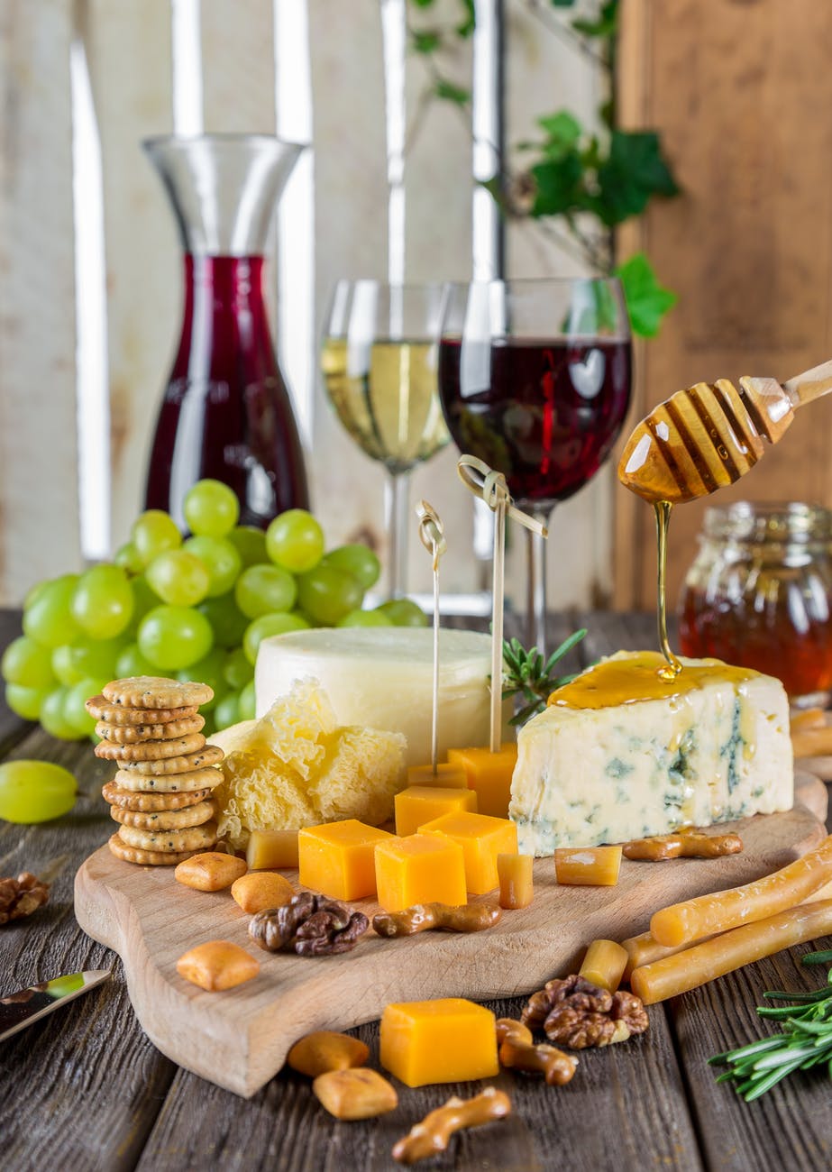
Natural occurring colours are appetizing because it’s primal. The colours that we tend to gravitate towards the most are reds and oranges. These are two colours associated with berries and citrus fruits. These are commonly found in food colours in vegetation. Even though green is the number one colour found it doesn’t say juicy, sweet or flavourful like berries and citrus. Sweet foods enact our pleasure receptors in our brains that make us crave more.
Not to say all foods that are not blue are not poisonous. Some foods can be poisonous if there are a vibrant red or orange. But we are very unlikely to eat foods that are white berries or with spots.
The most effective food colour for appetite is red. It is often found in restaurants and food menus.
Blue has the opposite effect. It is an appetite suppressant because it doesn’t convey action and hunger. Blue is a calming colour. In a blue room, some may feel like drinking tea or having small snacks are more fitting than a large meal.
But this is where colour is objective to anyone.

When designing a logo for a restaurant many people would go for a colour that everyone likes and a design people can relate to when it comes to food. Therefore, that’s a blue logo with a plate of food. It sounds good on paper because it sounds like people would like it. Blue is everyone’s favourite colour regardless of gender and it’s very versatile. But not when it’s about food. Blue is not the most an appetizing colour.
When designing for food any colour can be used but using colours often found in nature is best. Like greens, purples, yellows, reds and oranges. Blue is not found in nature. It would have to be made with chemicals and pigments. The only type of blue that can occur in nature are from stones like ultramarine and aquamarine or from bitter plants not meant for eating like indigo and woad.
Natural occurring colours are appetizing because it’s primal. The colours that we tend to gravitate towards the most are reds and oranges. These are two colours associated with berries and citrus fruits. These are commonly found in food colours in vegetation. Even though green is the number one colour found it doesn’t say juicy, sweet or flavourful like berries and citrus. Sweet foods enact our pleasure receptors in our brains that make us crave more.
Not to say all foods that are not blue are not poisonous. Some foods can be poisonous if there are a vibrant red or orange. But we are very unlikely to eat foods that are white berries or with spots.
The most effective food colour for appetite is red. It is often found in restaurants and food menus.
Blue has the opposite effect. It is an appetite suppressant because it doesn’t convey action and hunger. Blue is a calming colour. In a blue room, some may feel like drinking tea or having small snacks are more fitting than a large meal.
But this is where colour is objective to anyone.
Share this: